I´m going to explain more deep the settings i often use and give you some tips that help me and hope can help.
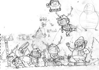
First the sketch!!, always using thumbnails to get a clear idea, i change some characters at the end.
then i just did a square for the message.
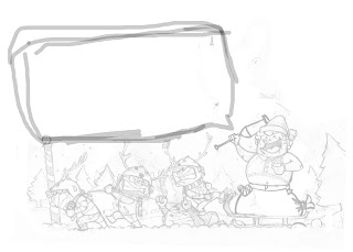
now after getting the picture the way i want,i start inking.
what i always use for inking is a program call:
"Sketchbook pro 2009" (but theres 2010 now and it cost $100, $80 in amazon) why this program?? because its very close to the way you ink when you´re using your pen,very natural lines and more reliable to your hand.
why not photoshop? i guess you can do it setting the brush but for me fotoshop doesn´t get that natural and flow feeling of the lines. like when you´re inking in natural way. you should try it but you need a wacom or tablet pen.
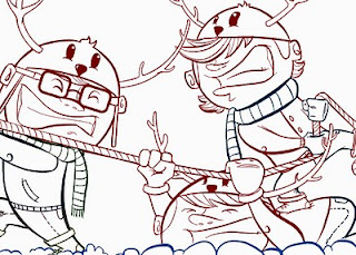
TIP: if you want a more warm feeling image use color in the lines. you´ll see the diferences when you use black lines.
it´s better paint the base first, so you can see the total scene how it´s going to look and what colors to change before you start giving ligths and shadows.

now to give shadows and lights, the 90% of the times i use my brush like these.
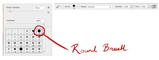
a round brush, opacity to 25% and flow 75% with the airbrush ¨"ON", and then you just play with the values of the flow.
TIP: use the numerical number pad or the numbers in the keyboard to set the values of the brushes faster. for example if you press 2 it would go 20%, if you go number 5 would be 50% and so on, it´s a shorcut and you don´t have to spend time moving the little bar.
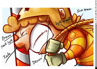
in the skin i always start using the red ones and pinks for the nose and ears, it gives a more warm feeling and volume to the face, i never use black color always use a dark brown (because is the face) black always give you a more heavy feeling and cuts the harmony of colors.
use black the less you can, always use a really dark value of the color your using but never getting the pure black.
In this step you can begin doing the shadow areas and then the light ones or vice-versa. it depends of how you feel more confident.
at the end i add some points of lights to give the sensation of direct light. this gives more volume and create a feeling that the character its really in the scene.
i´ll post the second part during the week thx, if you have more questions leave it here or send me an email.
take care.


