miércoles, 24 de marzo de 2010

Proyecto colectivo de ilustración


El grupo 27pm lanza su primer proyecto coletivo de ilustración, con el gusto de invitarlos a una convocatoria abierta a todo los latinoamericanos y participen creando una ilustración basada en el tema: Expedición, para más información: AQUI

Los rechazados


Son una serie de personajes que nunca vieron la luz, solo aqui!! :D
fue una propuesta para una campaña.

Todos los derechos reservados a rodolfo velado © y fitografito.com ©

miércoles, 17 de marzo de 2010

Qué pasa con la ilustración?


Para todos los salvadoreños interesados en la ilustración, vamos hacer una charla sobre el tema, y compartir con otra gente como nosotros que les apasiona esto, desen una vuelta si pueden.

y si vives afuera del pais puedes visitar nuestro sitio web, y estate pendiente ya que lanzaremos ciertos proyectos muy interesantes!!!

lunes, 1 de marzo de 2010

Payasin


Esta fue una colaboración para la univesidad nacional de Colombia, en el cual realizaron la expo CARITAS, por alguna razón aplazaron la expo pero espero en el futuro la continuen.

les dejo este wallpaper para iphone y ipod, asi que si te gusta bajalo y compartelo :)


tengan una bonita semana!!

Todos los derechos reservados a rodolfo velado © y fitografito.com ©

domingo, 24 de enero de 2010

Chirstmas card-Part 2

sorry for the late post.

to apply textures is really easy, if you´re familiar with photoshop just add the texture(to the top layer) and set the layer to "overlay".

but there is little trick: put different textures in different parts of your illustration.


you can add some grain effect: Noise>Add noise


TIP:if you got a texture and you want to modify the dark areas o white areas(like erasing it)


to create a pattern: use a solid color then go to filters>Filter Gallery>Sketch>Halftone Pattern.


thx, c ya around :D

lunes, 11 de enero de 2010

Christmas card process- Part 1

I´m going to explain more deep the settings i often use and give you some tips that help me and hope can help.

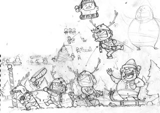
First the sketch!!, always using thumbnails to get a clear idea, i change some characters at the end.

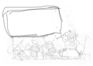
then i just did a square for the message.

now after getting the picture the way i want,i start inking.
what i always use for inking is a program call: "Sketchbook pro 2009" (but theres 2010 now and it cost $100, $80 in amazon) why this program?? because its very close to the way you ink when you´re using your pen,very natural lines and more reliable to your hand.

why not photoshop? i guess you can do it setting the brush but for me fotoshop doesn´t get that natural and flow feeling of the lines. like when you´re inking in natural way. you should try it but you need a wacom or tablet pen.
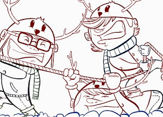

TIP: if you want a more warm feeling image use color in the lines. you´ll see the diferences when you use black lines.

it´s better paint the base first, so you can see the total scene how it´s going to look and what colors to change before you start giving ligths and shadows.
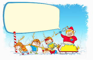

now to give shadows and lights, the 90% of the times i use my brush like these.
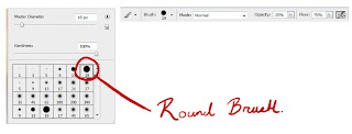

a round brush, opacity to 25% and flow 75% with the airbrush ¨"ON", and then you just play with the values of the flow.

TIP: use the numerical number pad or the numbers in the keyboard to set the values of the brushes faster. for example if you press 2 it would go 20%, if you go number 5 would be 50% and so on, it´s a shorcut and you don´t have to spend time moving the little bar.

in the skin i always start using the red ones and pinks for the nose and ears, it gives a more warm feeling and volume to the face, i never use black color always use a dark brown (because is the face) black always give you a more heavy feeling and cuts the harmony of colors.

use black the less you can, always use a really dark value of the color your using but never getting the pure black.

In this step you can begin doing the shadow areas and then the light ones or vice-versa. it depends of how you feel more confident.

at the end i add some points of lights to give the sensation of direct light. this gives more volume and create a feeling that the character its really in the scene.
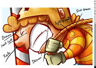


i´ll post the second part during the week thx, if you have more questions leave it here or send me an email.

take care.

viernes, 18 de diciembre de 2009

Tarjeta de navidad GRATISSS


Hola!!!

Les deseo una feliz navidad y un feliz año nuevoooo!!!

gracias a todas las personas que visitan el blog y se toman el tiempo en dejar un comentario.

Asi que si estas en apuros en estas navidades por todos los regalos que tienes que envolver, aqui dejo esta tarjeta navideña (tamaño carta) para que solo la imprimas y la cortes!!!!

asi de facil!! este es mi regalo para todos ustedesss.

asi que espero disfruten de estas fiestas y tengan una muy-muy-muy bonita navidad

Abrazos!!!

Todos los derechos reservados a rodolfo velado © y fitografito.com ©